Movie Ticket Reservation App

Streamlining Movie Ticket Reservations: an Efficient and Accessible App
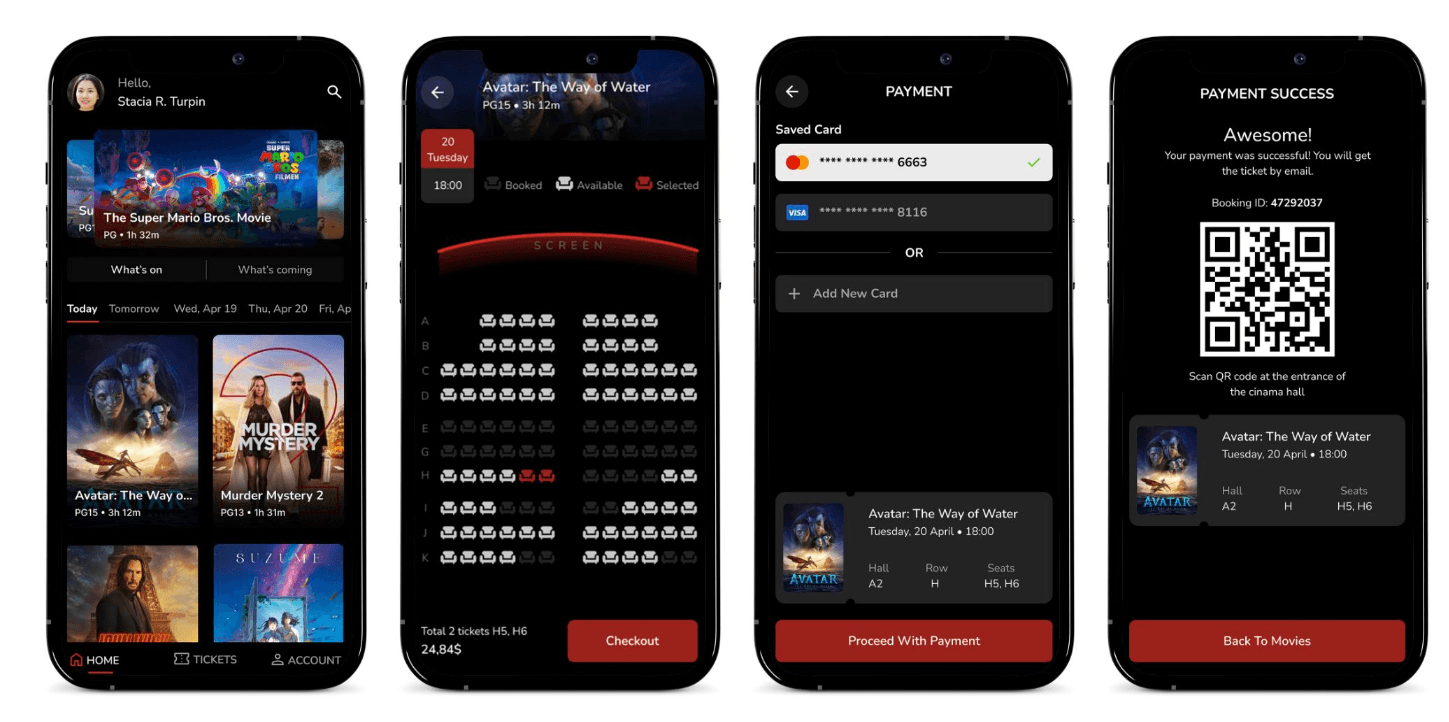
The project involved designing a seat reservation app for a movie theater, aimed at improving the ticket booking process for users. The circumstances included addressing pain points related to time-consuming ticket purchases, accessibility barriers, and information architecture challenges. Through user research and iterative design, the goal was to create a user-friendly app that would streamline the reservation process and provide a seamless experience for moviegoers.
Problem
The app aimed to solve was the inconvenience and time-consuming process of reserving seats at a movie theater. It aimed to simplify and streamline the seat reservation process, making it easier and more accessible for users.
Solution
Create a user-friendly and efficient mobile application that allows users to easily reserve seats at a movie theater. The app aims to simplify the process of purchasing tickets and selecting seats, enhancing the overall movie-going experience for users.
Understanding the user
User research: summary
For my user research on the movie theater app, I conducted a combination of qualitative and quantitative research. I started with a survey to get a broad understanding of user needs and preferences, then conducted in-depth interviews with a smaller group of users to gain more detailed insights.
Before conducting the research, I assumed that users primarily wanted a fast and easy way to reserve seats, but after conducting the research, I discovered that users also value having a visual representation of the theater layout, the ability to select seats with friends or family. Additionally, I learned that some users were hesitant to use mobile apps for purchasing movie tickets and preferred to use desktop websites instead.
Pain Points
Time
Users may feel frustrated if the app takes too long to load or if the checkout process is too time-consuming.
Accessibility
Users with disabilities may have difficulty navigating the app, selecting seats, or filling out payment information.
IA
Users may have difficulty finding the movie they want to see or navigating the app if the layout and organization are confusing or unclear.
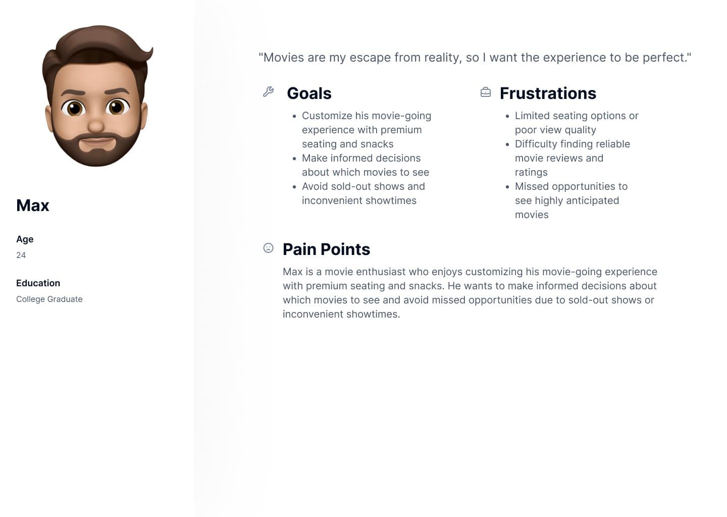
Personas
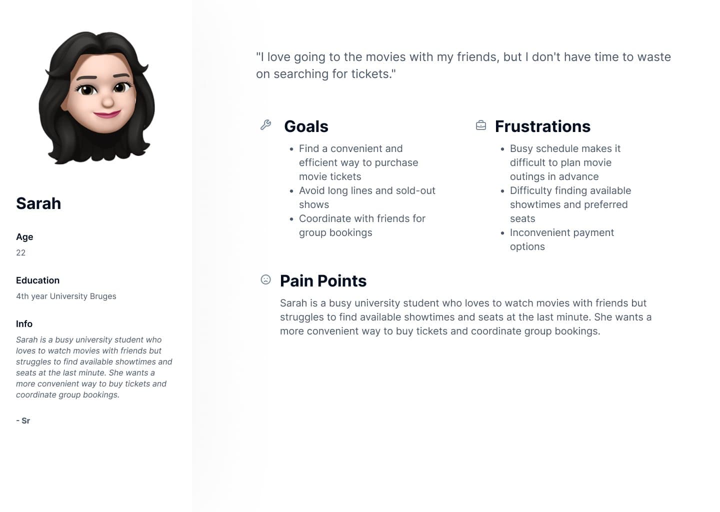
A young professional who needs a way to easily and quickly purchase tickets for a desired movie and showtime because she doesn't have a lot of free time and wants to make the most of her limited leisure time.
Starting the design
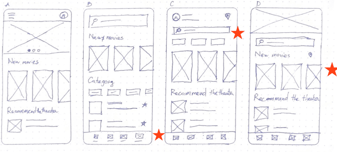
Paper wireframes
Taking the time to draft iterations of each screen of the app on paper ensured that the elements that made it to digital wireframes would be well-suited to address user pain points. For the home screen
Digital wireframes
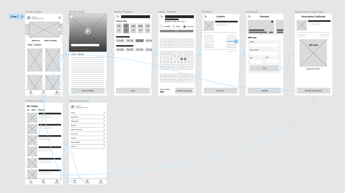
As the initial design phase continued, I made sure to base screen designs on feedback and findings from the user research.
Using the completed set of digital wireframes, I created a low-fidelity prototype.
Refining the design
High-fidelity prototype
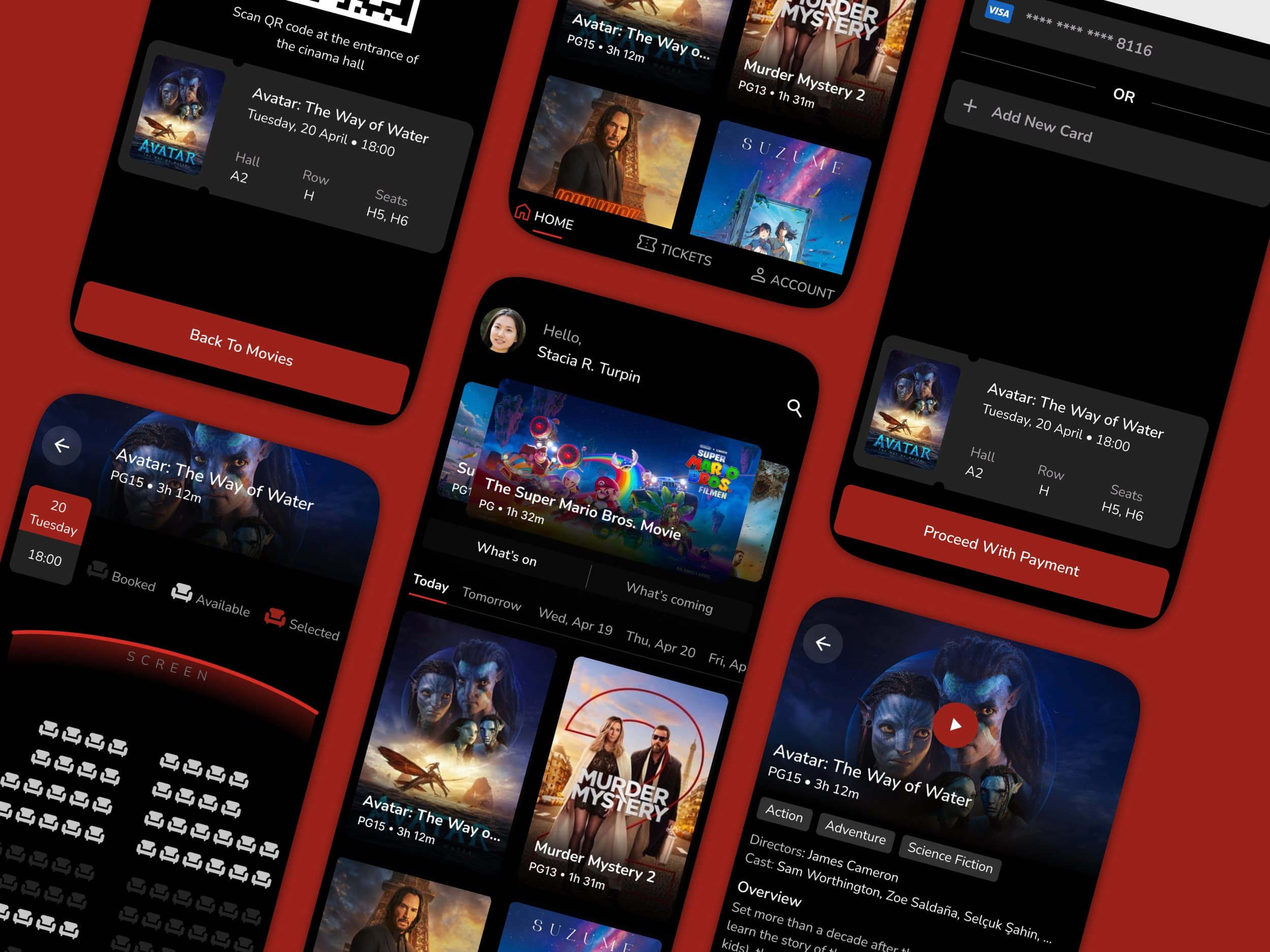
The final high-fidelity prototype presented cleaner user flows.
View the Moviee app high-fidelity prototype.
